
Digital marketers understand that each landing page element is meant to increase the conversion rate by fulfilling a specific purpose...
The headline gives them a peek into what your offer.
The copy educates them and lets them know how you can help.
The image adds visual appeal and sometimes shows the product or service in action.
The form collects the visitor’s information.
The CTA button tells visitors how to redeem the offer and what to expect next.
While all this is great for optimisation, one aspect is often overlooked – trust. Without trust, a compelling headline, copy, attractive images, an optimised form, or a contrasting CTA button won’t generate conversions.
If your page lacks trust and credibility, nothing else will be able to increase the conversion rate, and your bounce rate will probably skyrocket.
So, how do you establish trust and keep people engaged on your landing pages? Here are five great tips to get you started this holiday season.
How to create trustworthy landing pages to increase conversions
If your landing page doesn’t look credible to visitors, they will most likely exit the page straight away. To avoid that and increase your chances of converting, give our recommendations a read...
1. Ensure message match
Message match refers to the process of matching an ad’s primary message with that of the post-ad click page. Doing this provides reassurance to the visitor, and lets them know they have landed on the right page.
When we talk about message match, we’re not only referring to the headline, but to the imagery and primary branding colours as well (in the case of display ads).
When a prospects clicks your ad, they have certain expectations in their mind about what happens next. If the post-click landing page successfully fulfills those expectations, trust is established and any anxiety in their mind will disappear. You will then see an increase in conversion rate as a result.
Message match should be established between:
PPC ad and post-click landing page
Social media ad and post-click landing page
Email and post-click landing page
Here's how Optimove matches messaging:
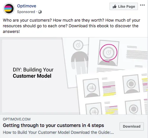
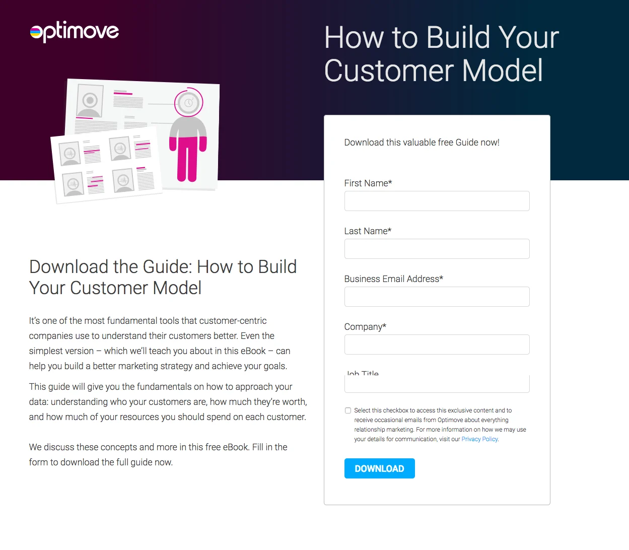
The ad and landing page headline both talk about building a customer model.
The imagery is designed in the same style throughout.
The landing page offer matches the ad.
When your ad and landing page match, user expectations are satisfied and trust is instilled to increase your landing page conversion rate.
2. Customer testimonials
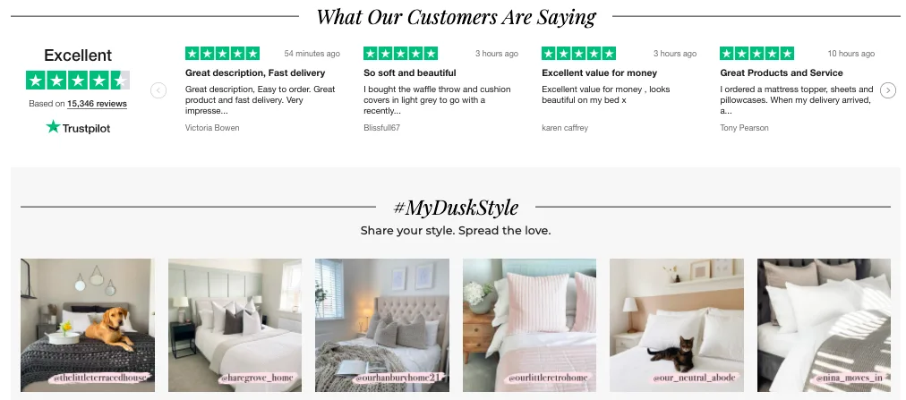
Featuring customer testimonials on your landing page adds credibility because they establish third-party social proof.
The concept of social proof dictates that people rely on the feedback and actions of others to determine their next course of action. For landing pages, this means showing prospects how your product or service has benefited others in a variety of ways.
Customer testimonials help you do just that. Indeed, today, 89% of global consumers check online reviews as part of their online buying journey, and 49% of global consumers consider positive reviews one of their top 3 purchase influences.
When adding customer testimonials, make sure the examples detail how your product or service solved their problem.
3. Logos
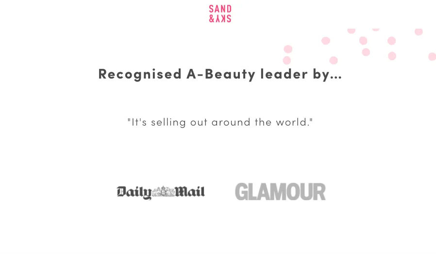
There's a good reason why so many web pages and landing pages display partner, press or company logos – the logos act as bragging rights for the host company.
Similarly to testimonials, adding logos provides additional proof that your service is legitimate and trustworthy. By seeing other companies' logos, prospects can’t help but think that your business is credible.
4. Security badges
Requesting prospects to enter their name and email address is one thing, but asking for credit card information is a much bigger ask. To make people feel comfortable entering financial details, you’ll want to provide certain security measures to keep their information safe. This is especially true on eCommerce pages where purchases take place.
Security badges or trust signals ensure visitors that it is safe to make a transaction on the page. An Actual Insights study found that security badges increased the perceived trustworthiness of a brand for 75% of respondents, and 61% of participants chose not to complete a transaction because security badges were absent.
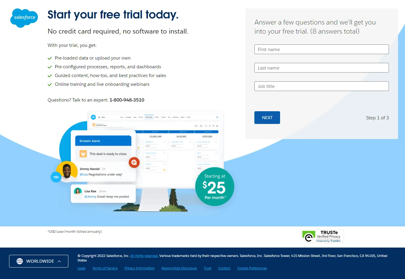
This Salesforce landing page features one security badge under the lead capture form:
5. Privacy policy link
This final tip may not be as recognisable as the others. However, it is just as important because it demonstrates transparency in how you collect and use data. Including your privacy policy link can direct visitors off the page and explain what will happen to their data if they convert.
They may not click the link, but having it accessible can reassure them and persuade them to move to the next step.
Trustworthy landing pages help you increase conversion rates
With just seconds to capture a prospect’s attention, especially during the holiday season, you must optimise your landing pages and make visitors feel comfortable converting.
Adding some elements to establish trust can do just that and help increase your conversion rate – for mobile conversions, too. Your prospects will appreciate it and your bottom line will thank you.
If you'd like to learn more about reviews and conversions, why not give our guide to CRO a read?


